![[Previous]](prev.gif) |
![[Contents]](contents.gif) |
![[Index]](keyword_index.gif) |
![[Next]](next.gif) |
![[Previous]](prev.gif) |
![[Contents]](contents.gif) |
![[Index]](keyword_index.gif) |
![[Next]](next.gif) |
A color-gradient and image background
PtWidget → PtBasic → PtContainer → PtBkgd
For more information, see the diagram of the widget hierarchy.

<photon/PtBkgd.h>
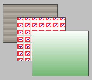
The PtBkgd widget provides a background of a color gradient with an optional image on top of it. The image can be tiled across the gradient.

Several different styles of background widgets.
A PtBkgd widget is filled with a color gradient that's based on the widget's Pt_ARG_FILL_COLOR and Pt_ARG_CONTRAST (defined by PtBasic). For example, the background could start from dark blue at the top and gradually fade to light blue at the bottom.
On top of this gradient, you can display an image, defined by the Pt_ARG_BKGD_IMAGE resource. If the image is smaller than the PtBkgd widget, you can tile the image in various ways by setting Pt_ARG_BKGD_SPACING_X, Pt_ARG_BKGD_SPACING_Y, and Pt_ARG_BKGD_TILE.
| Resource | C type | Pt type | Default |
|---|---|---|---|
| Pt_ARG_BKGD_IMAGE | PhImage_t * | Image | NULL |
| Pt_ARG_BKGD_SPACING_X | short | Scalar | 0 |
| Pt_ARG_BKGD_SPACING_Y | short | Scalar | 0 |
| Pt_ARG_BKGD_TILE | uint8_t | Scalar | Pt_BKGD_GRID |
| C type | Pt type | Default |
|---|---|---|
| PhImage_t * | Image | NULL |
A pointer to a PhImage_t structure that defines the image to be displayed. If it's NULL, no image is displayed. For more information, see PhImage_t and PxLoadImage() in the Photon Library Reference.
Set the flags member of the PhImage_t structure to:
Ph_RELEASE_IMAGE | Ph_RELEASE_PALETTE |
Ph_RELEASE_TRANSPARENCY_MASK | Ph_RELEASE_GHOST_BITMAP
before providing the image to the widget. If you do this, the memory used for the image is released when the widget is unrealized or destroyed.
 |
When you set this resource, the widget copies the PhImage_t structure but not the data pointed to by the members of the structure. After setting this resource, you can free() the PhImage_t if you don't need it, but don't free() the members of it. |
| C type | Pt type | Default |
|---|---|---|
| short | Scalar | 0 |
The horizontal spacing between tiles, in pixels.
| C type | Pt type | Default |
|---|---|---|
| short | Scalar | 0 |
The vertical spacing between tiles, in pixels.
| C type | Pt type | Default |
|---|---|---|
| uint8_t | Scalar | Pt_BKGD_GRID |
This resource determines the type of tiling used to display the image. Possible values:
If the widget modifies an inherited resource, the “Default override” column indicates the new value. This modification affects any subclasses of the widget.
![[Previous]](prev.gif) |
![[Contents]](contents.gif) |
![[Index]](keyword_index.gif) |
![[Next]](next.gif) |